Color Trends of the Year
In 2020, many clients rediscovered their love for their home and their outdoor space. The pandemic changed how clients see their homes, how they live, and even their décor. From transforming their home into an ideal space to spending more time outside, designers are spending more time creating the perfect space for clients to live, work, and relax. We are seeing more color trends being considered when designing client spaces; read on to see our favorite color trends of the year.
Jewel Tones

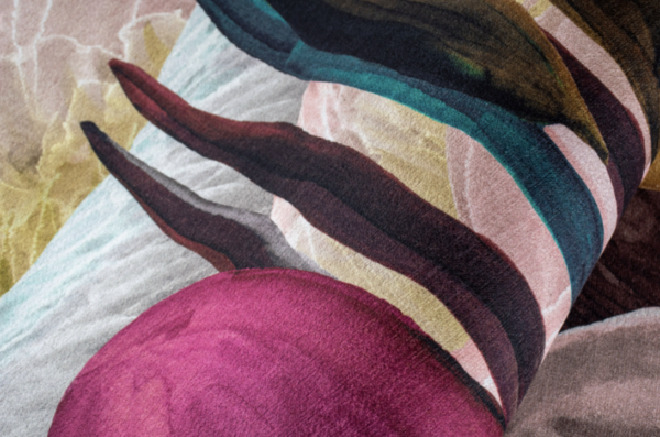
Rich jewel tones add a refreshing pop of color to a room; this trend is bound to be a hit with clients this year. Colors like ruby, saffron, and sapphire are visually stimulating and add an energetic look to space. From wall colors to jewel-toned throw pillows, expect to see these shades on their own or paired as an accent with neutral color palettes. The jewel-toned shades will undoubtedly catch the eye, and the neutral color palette will accentuate it.
Sunny Hues

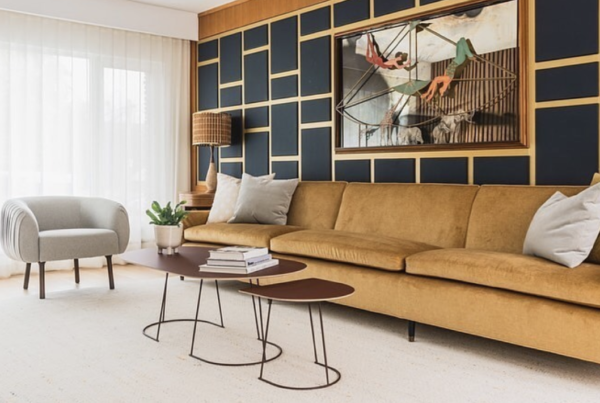
Sunny hues are making a significant impact this year. Yellow shades ranging from bright to soft are being used as neutrals and accents to warm-up rooms. But don’t let the sunny term fool you; mustard shades and burnt oranges will also help create a welcoming vibe. Clients are starting to incorporate peacock blue into their decor to accentuate the sunny hues. It works well to brighten up a room and create a warmer color palette while adding depth to the room.
Primary Palettes

Primary colors are making a statement this year. While we know this trend may seem a bit young, designers love incorporating this trend against muted palettes. Choose one or two primary colors to pair with a natural palette, and the primary colors will draw the eye, making it the perfect way to accent statement pieces. The vibrant shades help make a piece stand out from the rest of the room, be sure to choose primary accents that will show off the client’s true personality. It will help bring color into the room and show off their unique style without overpowering the space.
Pantone Colors
Earlier this year, Illuminating Yellow and Ultimate Gray were chosen as the 2021 Pantone colors of the year. These two classic colors work well on their own, with yellow adding a bright pop of color and gray adding a neutral color in the room. The two colors work together to express strength and add an uplifting look to the room. Whether on their own or paired together, these two colors are a great starting point when deciding on a client’s color palette.
Earthy Shades

Natural, earthy shades are a trend that is here to stay. An earthy color palette is packed full of rusts, warm greens, deep reds, and browns and is inspired by the open landscapes. We are seeing this integrated into client homes more and more to create comfortable, welcoming spaces.
Ocean Hues
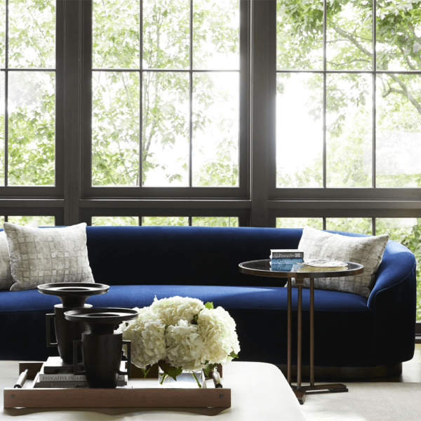
Is there anything more relaxing than being poolside or by the beach? Expect to see more and more clients integrate these calm and soothing colors into their homes with aqua and inky blues. The ocean shades work great in contemporary spaces while offering a peaceful and tranquil environment. Blue shades are the perfect addition and can be integrated into client homes with paint colors, furniture, and decor items.
What color trend do you love so far this year? We’d love to know!